


Ask in plain language
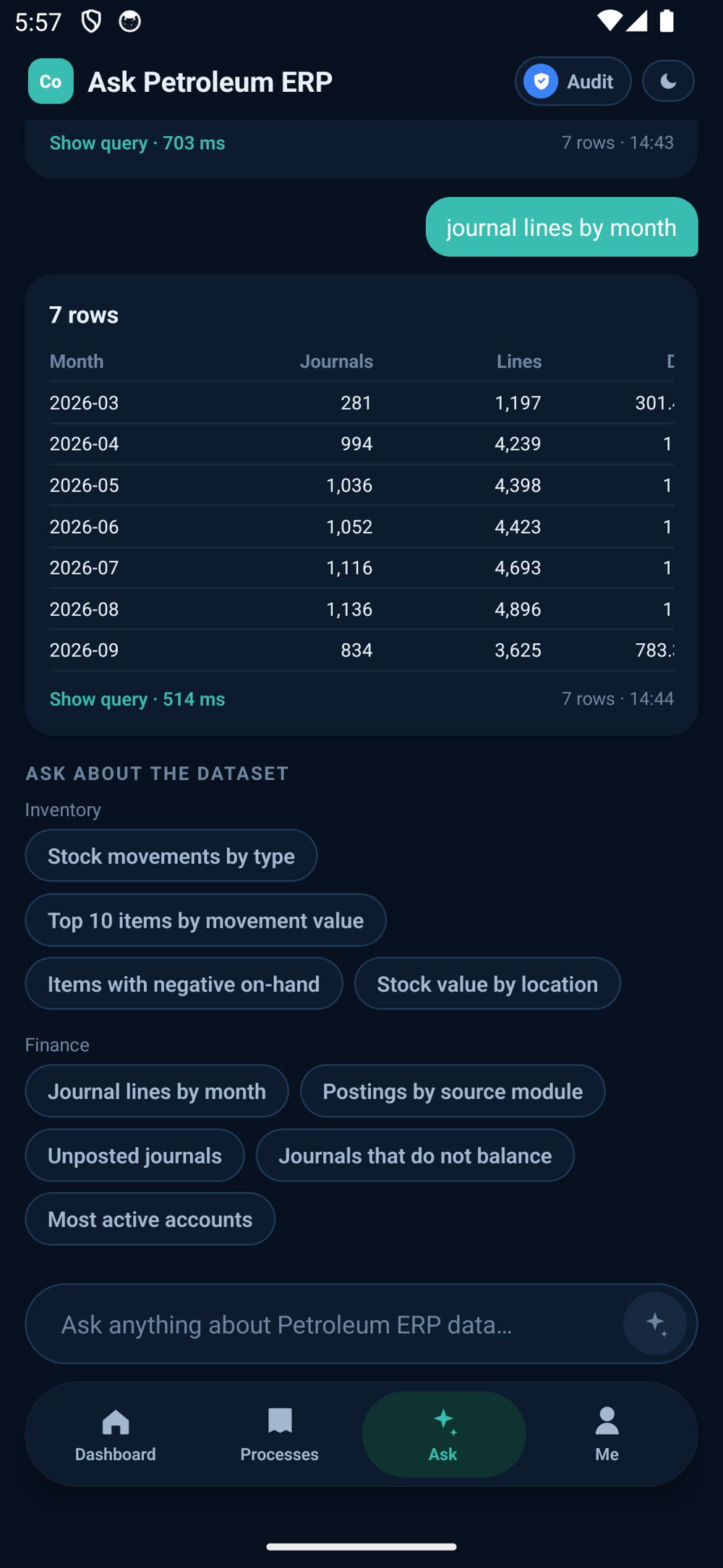
"Top 10 suppliers by value this year." "Sales vs purchases by month." The answer comes back as a proper report: the assumptions, a table with totals, and what stands out.
Ask your own business data the way you would ask a colleague, and draw the dashboard you always wanted (your charts, your columns, your order) on the web or on your phone.
iPhone and iPad: the App Store release is in review. Ask us for a TestFlight invitation in the meantime.
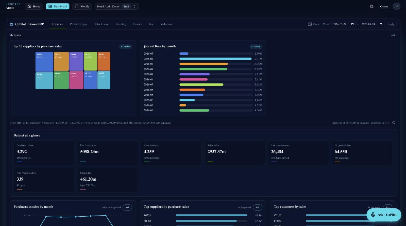

The other half of the portal is not about findings at all; it is about your business data. Ask it a question the way you would ask a colleague, and build the dashboard you always wanted but never had time to specify.
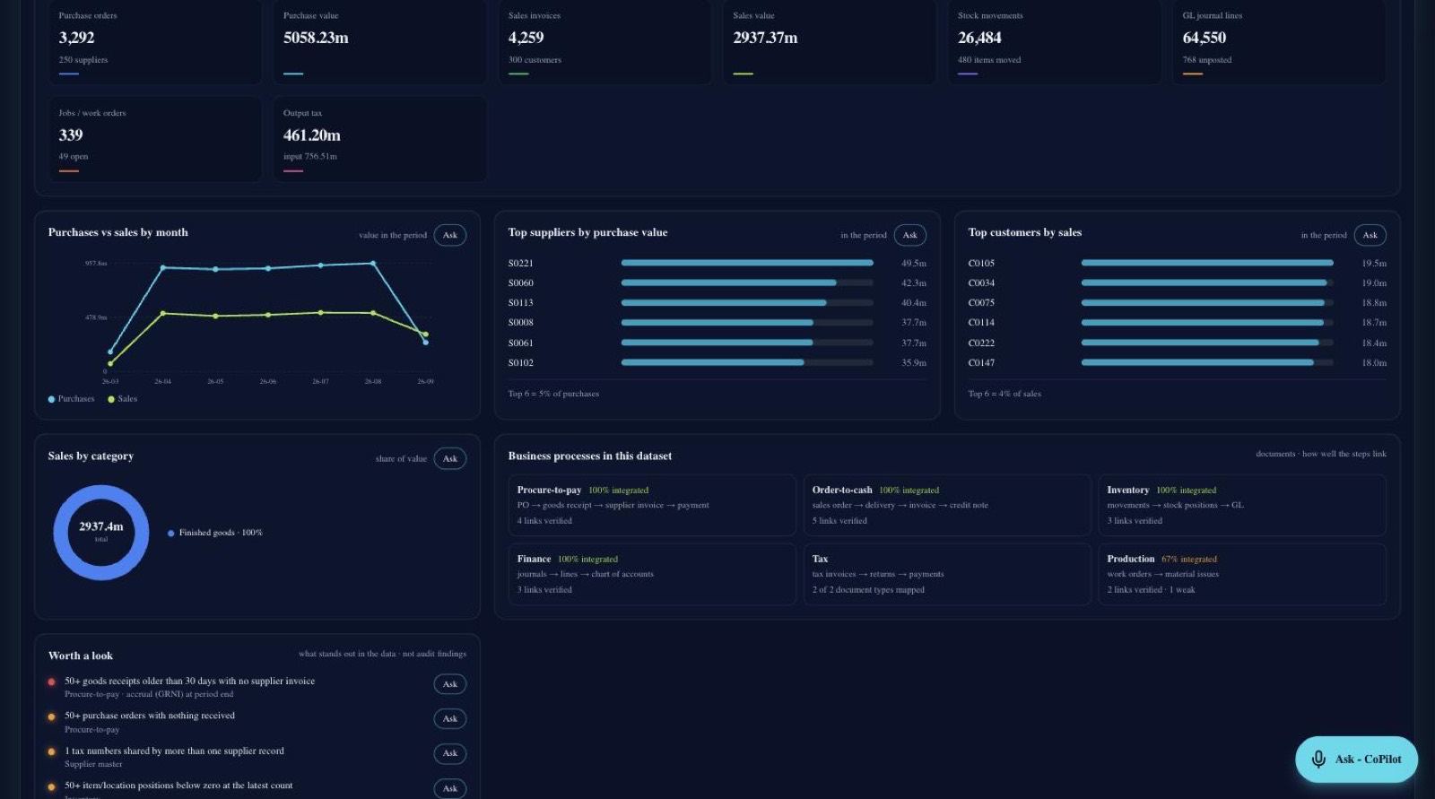
"Top 10 suppliers by value this year." "Sales vs purchases by month." The answer comes back as a proper report: the assumptions, a table with totals, and what stands out.
Pick a chart, describe the figure in a sentence, give it a position. Your charts, your columns, your order, saved to your account and waiting on your next sign-in.
CoPilot reads the same approved feed the rules read, so a figure on your dashboard and a finding in the audit can never disagree.
Legacy system? On-premise database? No public API? API Connector sits next to your ERP and turns the tables you choose into a safe, read-only API. You decide what leaves the building, table by table, column by column, and nothing else is ever visible to the portal.
Windows, Linux (deb, rpm incl. Oracle Linux 7), Docker and macOS in one package, with the Installation Guide. No source code. Download the package · Installation guide · more in API Builder.
Each company is isolated in its own workspace. Rows are filtered by the connector, protected again in the database, and every download is logged.
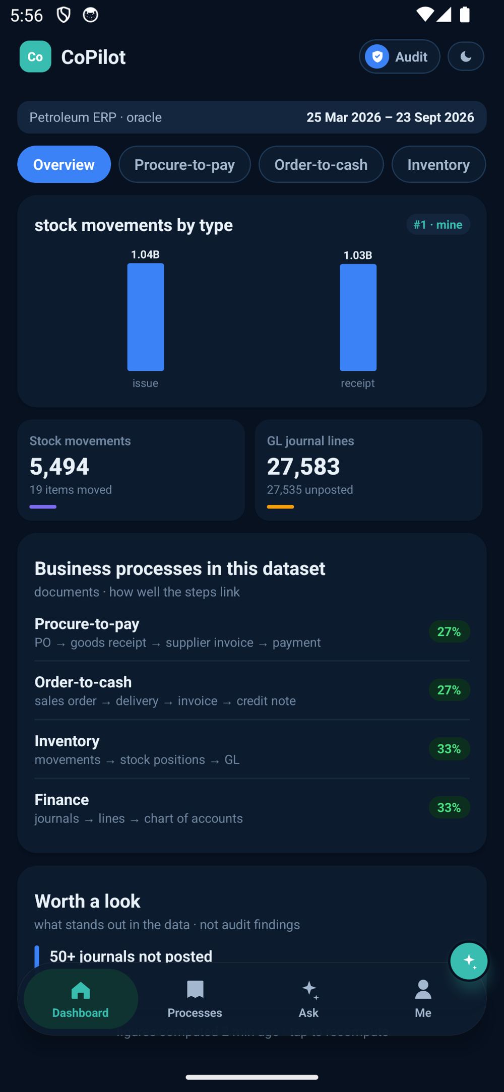
Ask a question once, then keep it: pick a chart, describe the figure in a sentence, give it a position, and it is waiting on your dashboard, on the web and on the phone.
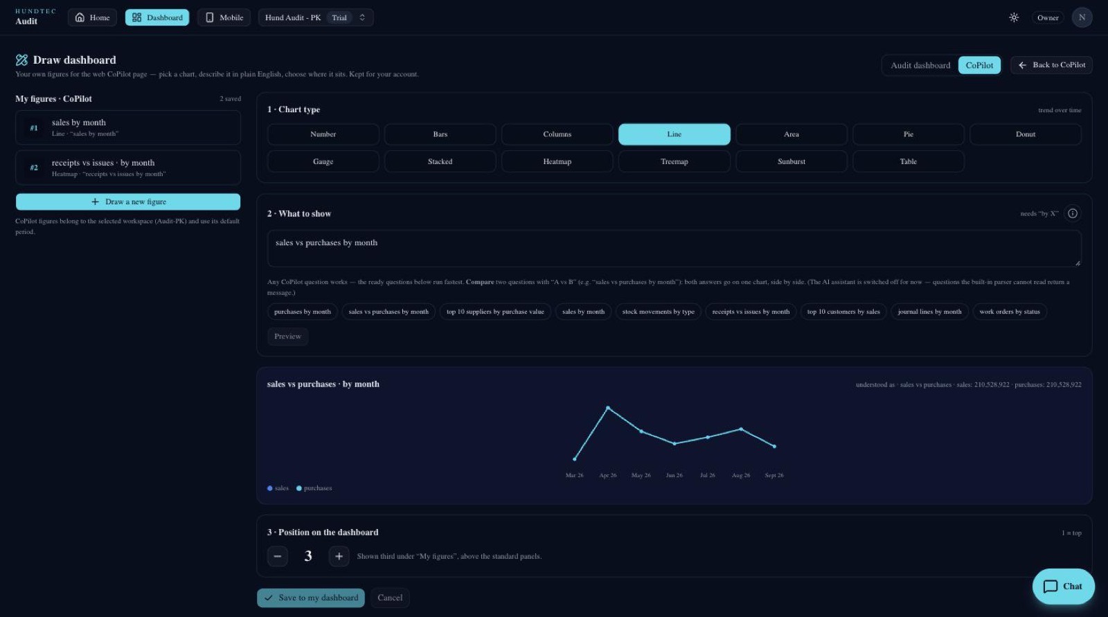
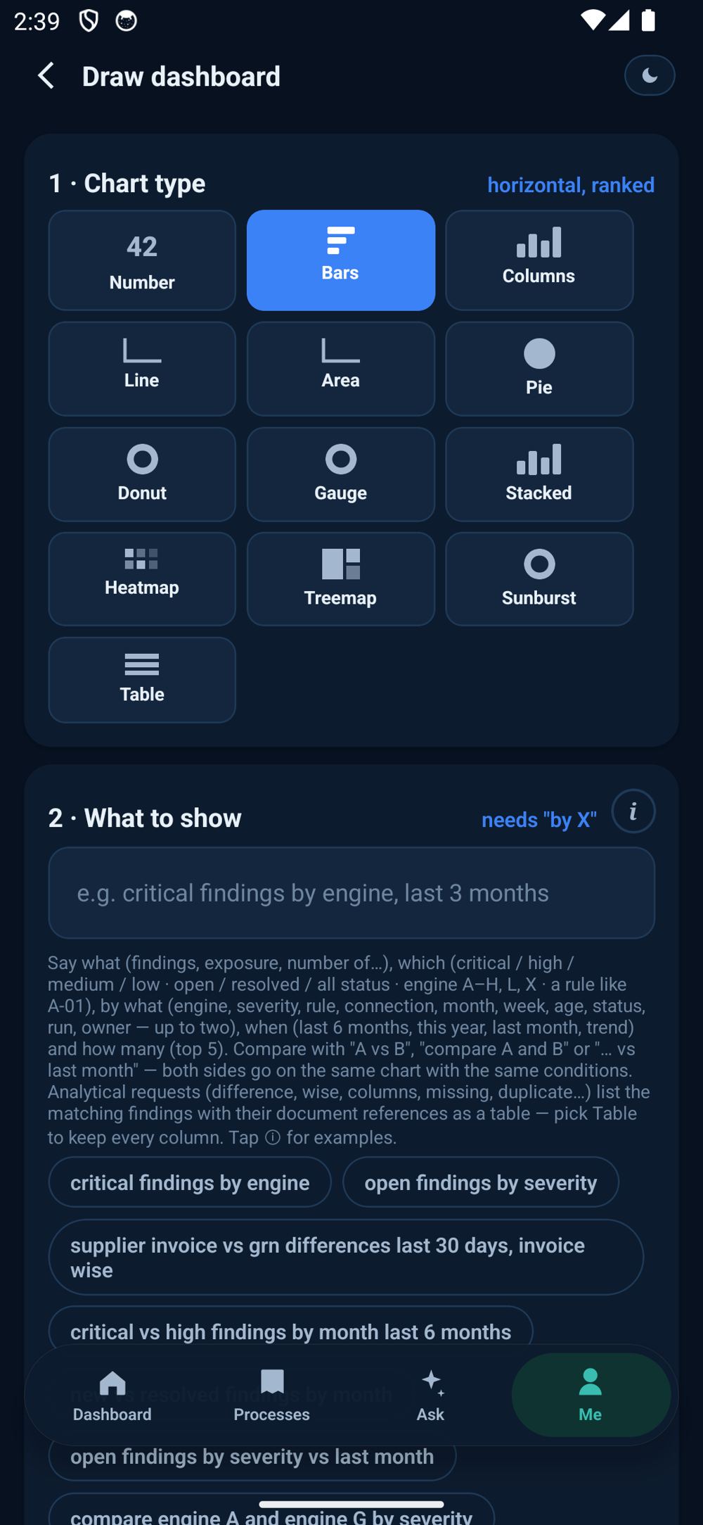
“critical vs high findings by month last 6 months”, “top 10 suppliers by purchase value”. Two things compared with vs land on one chart, with the same conditions on both sides.
Number, bars, columns, line, area, pie, donut, gauge, stacked, heatmap, treemap, sunburst and a plain table. Pick the one that makes the point.
Position 1 is the top. The figure appears above the standard cards on the web and on the phone, and it is yours. Other people's dashboards are untouched.
iPhone, iPad and Android. Night mode by default, Arabic and English, and updates that arrive by themselves. No reinstall.
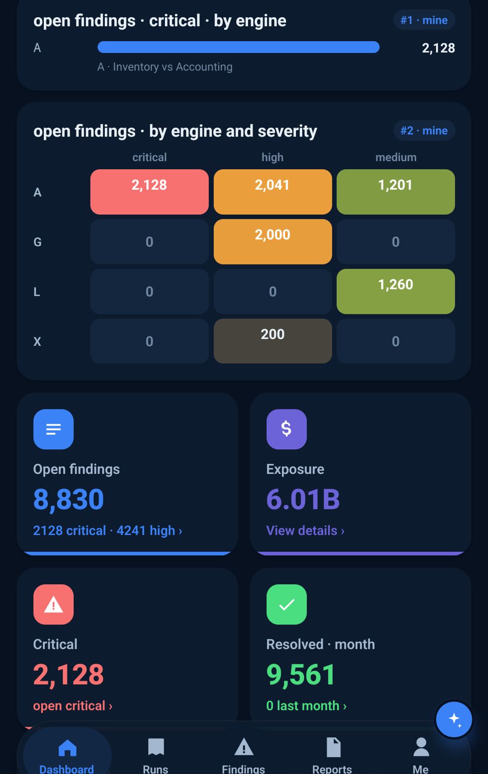
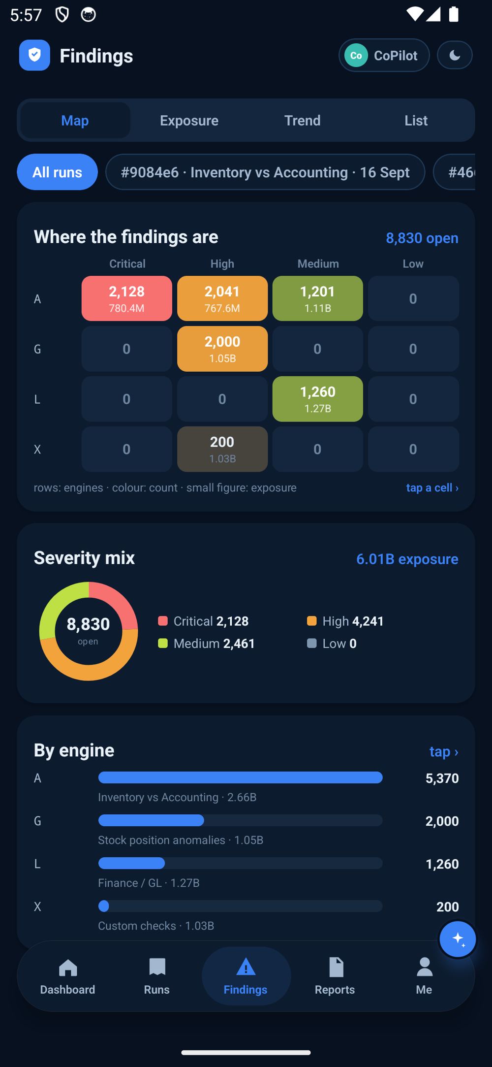

The same connection also powers the audit: every document tested every night against your own rules, with the alerts on your phone.
The question typed, the report back, the table turned into a chart, the axes chosen, a figure drawn and placed on the dashboard. Every number on screen is real data from a live workspace.
Connect once, pick the data you are willing to share, and let Vigilon watch it from tonight. Free 30-day trial, no card.
Questions, a demo on your own data, or a TestFlight invitation for iPhone: talk to us.


